Typography
To secure ease of use, maximum compatibility and adherence to our guidelines, Arial and Times New Roman have been implemented in our Microsoft Office templates.
Two distinct type families are part of the Wilhelmsen visual identity: Aktiv Grotesk, a 21st century interpretation of a grotesque sans typeface, and Tiempos, a modern interpretation of old style typography. Both offer excellent readability. When combined and used according to our typographic hierarchy they unify messaging and support brand recognition.
Aktiv Grotesk is available from Dalton Maag [https://www.daltonmaag.com]. It has the following script support: Latin Script, Extended Latin, Cyrillic Script, Greek Script, Hebrew Script, Arabic Script, Arabic Script Extended, Simplified Chinese (GB 18030 Certified), Traditional Chinese, Japanese, Korean (Hangul). The Latin/Extended Latin version in all relevant weights is included with our Adobe Creative Cloud subscriptions, so those working with CC should synchronise the fonts through Adobe Typekit.
Tiempos is available from Klim [https://klim.co.nz]. It supports Latin Script and Extended Latin. Finding a suitable replacement typeface for other languages should be handled locally, however we encourage you to contact Corporate Communications for approval before licensing any new typeface.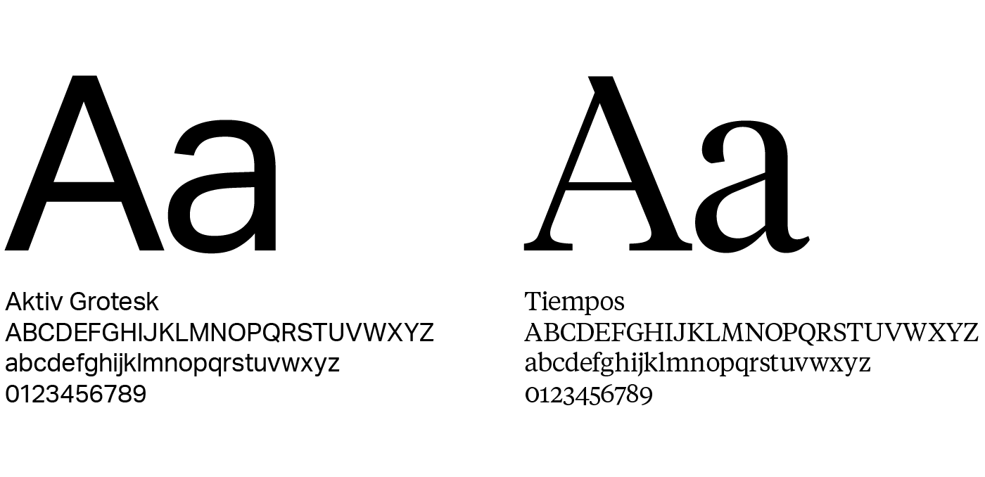
Typographic Hierarchy
Primary headline: Tiempos Headline Light
Secondary headline: Aktiv Grotesk Bold
Introductory text: Aktiv Grotesk Light
Subheadline: Aktiv Grotesk Bold
Primary body copy: Tiempos Text Regular
Secondary body copy (info & short texts): Aktiv Grotesk Regular
Large text: Tiempos Headline Light / Aktiv Grotesk Light

Fallback Typography
If for some reason our chosen brand typography cannot be used, for example because of technical limitations or cost/licensing challenges we fall back to the following typefaces:
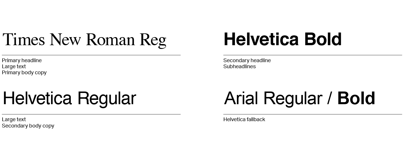
Primary headline: Times New Roman Regular
Secondary headline: Helvetica Bold
Introductory text: Helvetica Regular
Subheadlines: Helvetica Bold
Primary body copy: Times New Roman Regular
Secondary body copy (info & short texts): Helvetica Regular
Large text: Times New Roman Regular / Helvetica Regular
If Helvetica is not available, you may use Arial. To secure maximum compatibility, Arial has been implemented in our Microsoft Office templates.
We have also defined a fallback order for web font implementation:
Aktiv Grotesk fallback: 'Helvetica Neue', Helvetica, Arial, sans-serif;
Tiempos and Tiempos Headline fallback: Times New Roman', Times, Baskerville, Georgia, serif;