Colour system
Primary Palette
The primary palette consists of five colours. Wilhelmsen Blue is our main colour. It is used extensively throughout the visual identity and carries the most brand recognition. We do not prioritise between the other four colours. The colours of the primary palette can also be used in tints of 50, 70 and 85%.

Neutral Palette
In addition to black and white, the neutral palette comprises four shades of grey. White is mainly used as a background colour, unifying and elevating the colours of both the primary and secondary palette as well as giving the brand a clean and sophisticated look. Black should be reserved for text.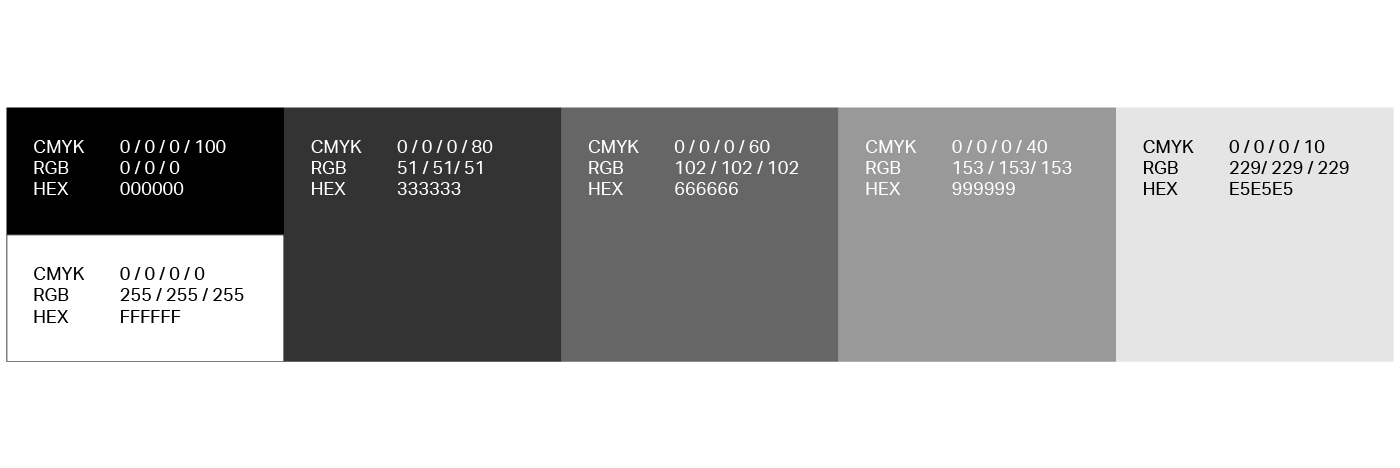
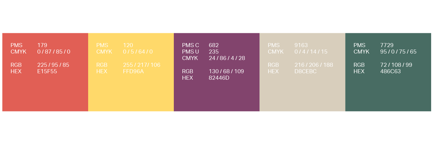
Secondary Palette
The secondary palette has been developed to complement our primary colours. It provides greater versatility in situations where many colours are needed, e.g. to create complex graphs and charts. Use this palette sparingly, and only when the primary and neutral palettes do not suffice.