Supplier brand guide
Our identity is the visual expression of our company. This is represented visually through a carefully selected group of graphic elements: logo, typography, colour, and imagery.
How these elements are applied is important. On this site, you will find guidelines on how you as a supplier can apply the Wilhelmsen brand identity correctly.
Brand elements
-

Logo system
It is vital for all our suppliers to make sure they have replaced the old Wilhelmsen logo with the new Wilhelmsen logo in product labels, product description information sheets, user manuals, instructional guides and all relevant documents.
-
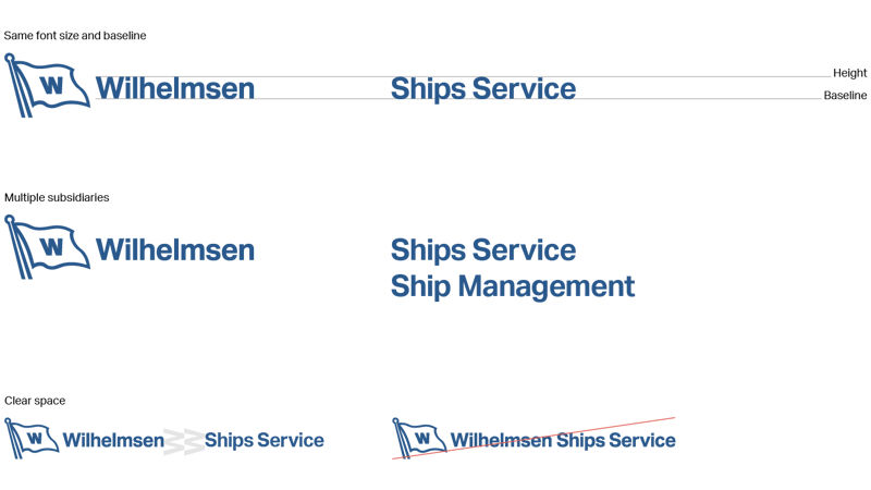
Subsidiary identity system
The Wilhelmsen logo is now the logo for all of our companies. We no longer have individual logos for Ships Service, Ship Management, etc. They are to be referred to as subsidiary identifiers.
-
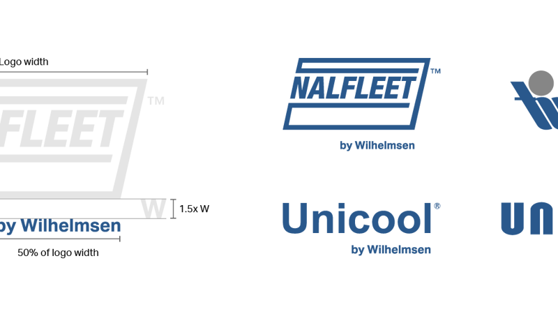
Product branding system
Our product brands are endorsed by the Wilhelmsen master brand. “by Wilhelmsen” set in Aktiv Grotesk Bold is placed below and right aligned with the logo.
-
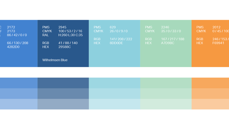
Colour system
Colour is a key factor in ensuring rapid recognition of our brand, and it is therefore important that our brand colours are reproduced accurately. We have defined our colours with specific values for both print and screen. Always make sure you adhere to these specifications for all applications.
-

Typography
Our two font families are to be used at all times when developing professionally printed documents, like business cards, brochures and catalogues, etc. Since these are professional fonts and subject to licensing programs, the use is reserved for internal graphic designers and external agencies. For regular office documents or if for some reason our chosen brand typography cannot be used, the only acceptable replacement fonts are: Times New Roman (for Tiempos), as well as Arial or Helvetica (for Aktiv Grotesk).
-
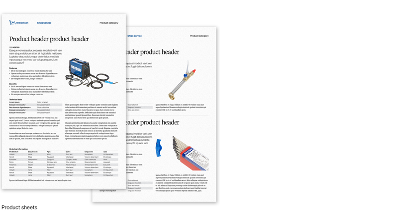
Assets and documents
In this section you will always find the latest versions of our manuals, instructions guides and product labels.